E-COMMERCE DASHBOARD
SmartSource E-commerce Dashboard | Cencora | 05-2024
Product Design, UI, UX, Research
Lead designer
RESEARCH METHODOLOGY
A Mixed Methods research design is a procedure for collecting, analyzing, and ”mixing” both quantitative and qualitative research and methods in a single study to understand a problem.
THE GOAL
Optimize the SmartSource Homepage Dashboard to maximize space and content to serve the goals of the user and business, primarily to increase transactions.
USER PERSONA
Since SmartSource is a secondary wholesale drug retailer, users come to the site as needed with a very specific goal – to search and buy a particular product list that’s not available at their primary storefront. Unlike other e-commerce storefronts, users are not primarily here to browse and shop.
User Goal: Search and buy a specific product list that their primary retailer does not carry
Business Goal: Increase transactions and conversions from the Homepage dashboard
How Might We…leverage both quantitative and qualitative data to synthesize findings that inform an optimized dashboard design ?
QUANTITATIVE DATA TAKEAWAYS
(Google Analytics/FullStory)
View Past POs for product reference - 60% of user engagements on My Orders Page are looking at past POs for reference to order the same products again (from session replays)
Make payments/Apply credits to invoices - a combined 29% of user engagements on My Invoices Page are looking at open credits and making payments
HP Heatmap pattern to search and add - many searches are happening in the top main search as well as Quick Add in cart, opportunity to offer more direct CTAs from the dashboard and search inputs
QUALITATIVE DATA TAKEAWAYS
(CSP User Research Co-creation/Qualtrics Survey)
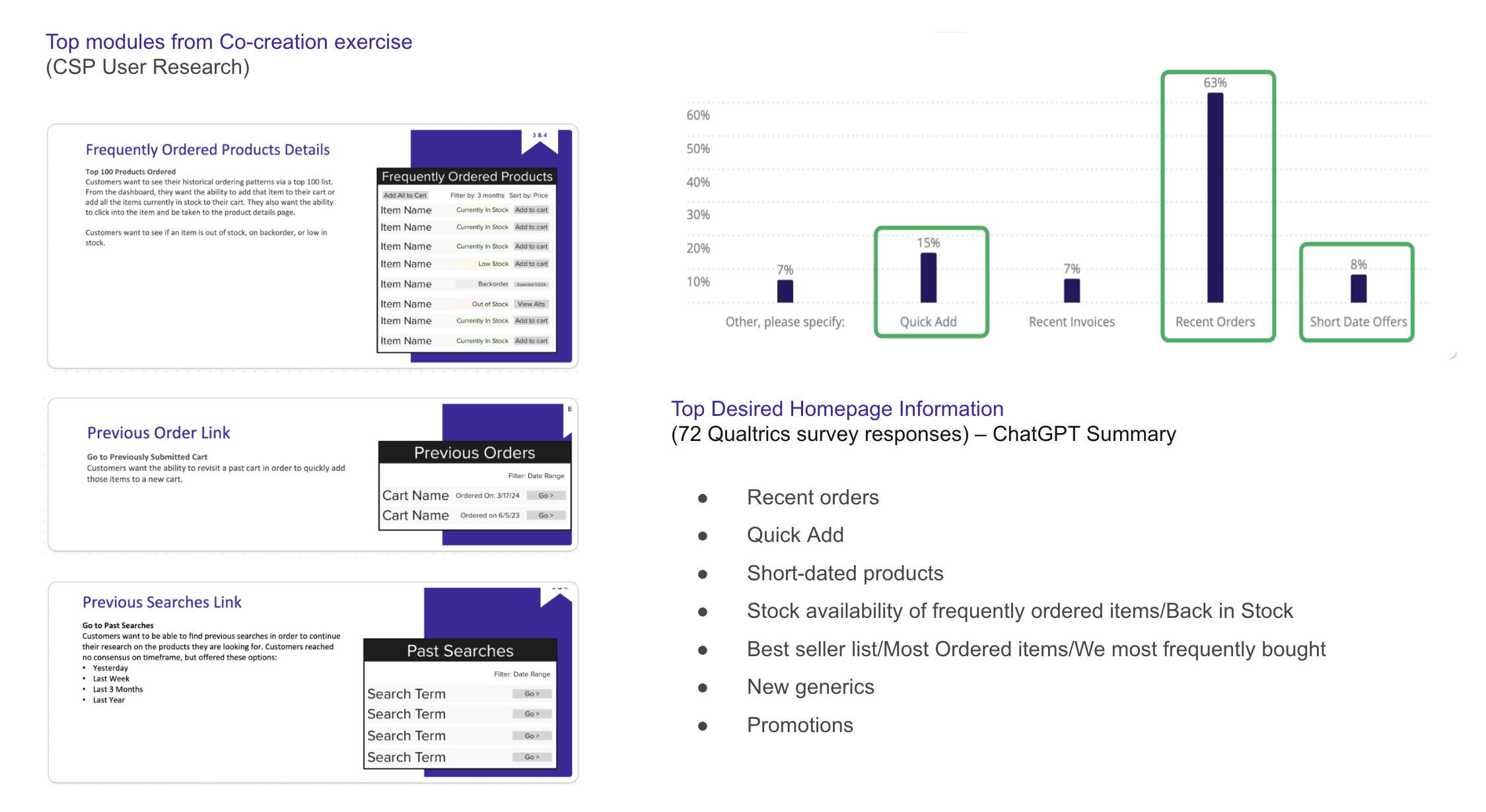
Product Stock Availability - ranked high in Top Desired Homepage Information (72 survey responses) – ChatGPT Summary prioritizes requested feature list with Stock availability as a primary concern, consider Back in Stock module
Frequently Ordered Products/Previous Order - from Co-creation research, users wanted to view historical ordering patterns and Add to cart
Previous Searches Link - Many searches are repeat searches for the same products, Offer saved searches or display previous search links
CURRENT DESIGN AUDIT
Next, I analyzed the performance of each homepage element to optimize engagements and transactions - prioritizing the persistent cart view and above-the-fold content.
DESIGN RECOMMENDATIONS
Quick Links in Navigation - Test new category links since it’s already high in engagement, mirrors transactional modules below the fold
Data shows that multiple entry points increases page view
Search/Quick Add - Offer links in menu dropdown on search input
Show Recent Searches on main search
Show Frequently Ordered Products on Quick Add search in cart
Optimize Above the Fold - Create more actionable links from the dashboard to Recent Orders and Open Invoices
Keep banner dismissible and remove promo at top
Update Recently Purchased title to Buy it Again and Add to Cart button
Create New Cart button on Recent Orders and Pay Invoice button on new Upcoming Payment module
Browse Below the Fold - Test various product category modules, when a module has not enough content, display various 1-2 column modules next in prioritized responsive order:
Back in Stock (new), Short Dates, Best Sellers, New Generics (new), New Products, Weekly Specials
Persistent Cart - Open cart performs better than closed
Keep offers at the bottom since discounts are top requested by users
Announcements - Reduce to 1-column module
Tabs navigation for Recalls, New Products and Messages (PDF downloads)
LAYOUT, SPACE and HIERARCHY OF CONTENT
Desktop optimized
Content fills container at 1440px (currently 1410px), margins at larger breakpoints for whitespace
12 column layout on a 4px grid with 24px gutter
Module widths are set to % rather than fixed so that they respond to varying screen widths
Empty modules will be hidden, display next module in prioritized responsive order and test best performing product category
Hierarchy of content:
Prioritize personalized products from past orders at the top
Keep Recent Orders & Invoices above the fold, Browsing products is passive, test modules below the fold
CLOSED CART - RESPONSIVE MODULES
Next Steps:
Plot each optimization/module on a prioritization matrix
Present to broader stakeholders for development buy-in and feasibility check
Run usability tests for task completion and validation of the design


